Bad Data Visualization Examples: A Guide to Avoiding Common Mistakes
Introduction
In the realm of data analysis and interpretation, data visualization stands as a powerful tool that allows us to transform complex information into easily digestible visuals. By visually representing data through charts, graphs, and infographics, we can uncover valuable insights and communicate findings effectively. However, the effectiveness of data visualization hinges on the clarity and accuracy of the visual representation.
The importance of effective data visualization cannot be overstated. It serves as a bridge between raw data and meaningful insights, enabling us to make informed decisions and tell compelling stories. On the flip side, the impact of bad data visualization can lead to confusion, misinterpretation, and ultimately, flawed decision-making. As we dive into this article, we will explore common mistakes in data visualization and showcase examples that highlight the pitfalls to avoid. Let’s embark on a journey to enhance our data visualization skills and steer clear of the traps that can hinder our understanding of data.
Common Mistakes in Data Visualization
Cluttered Charts and Graphs
When it comes to data visualization, less is often more. Cluttered charts and graphs overwhelm the viewer, making it challenging to extract meaningful insights. Simplifying the visual elements and focusing on the key data points can significantly enhance the clarity and impact of the visualization.
Misleading Labeling or Scaling
Misleading labeling or scaling can distort the interpretation of data, leading to incorrect conclusions. It is essential to ensure that labels accurately represent the data being presented and that scales are appropriately calibrated to provide an accurate depiction of the information. By maintaining transparency in labeling and scaling, we can avoid miscommunication and misinterpretation in data visualization.
Lack of Context or Explanation
Data visualization without context or explanation leaves viewers in the dark, unable to fully grasp the significance of the data. Providing context and explanations alongside visualizations helps guide the audience through the information, enabling them to understand the story behind the data. Context is key in ensuring that data visualizations are not only visually appealing but also informative and actionable.
Poor Choice of Chart Type
Selecting the wrong chart type for the data at hand can hinder the effectiveness of data visualization. Each chart type serves a specific purpose, and choosing the appropriate one is crucial for accurately representing the data. By understanding the strengths and limitations of different chart types, we can ensure that our visualizations effectively communicate the intended message.
Inconsistent Color Schemes
Inconsistent color schemes in data visualization can create confusion and distract from the main message. Using a cohesive color palette that aligns with the data being presented helps maintain visual clarity and coherence. Consistency in color schemes not only enhances the aesthetic appeal of the visualization but also improves the overall readability and understanding of the data.
Examples of Bad Data Visualization
Pie Charts with Too Many Categories
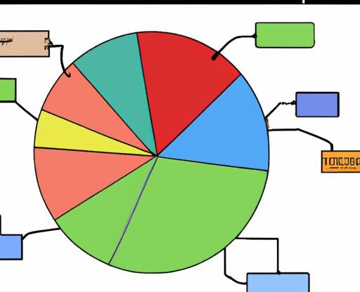
Pie charts are a popular choice for displaying proportions, but when overloaded with numerous categories, they can become cluttered and difficult to interpret. Each slice in a pie chart should represent a distinct category, and when there are too many categories, the chart loses its effectiveness in conveying meaningful insights.
3D Charts that Distort Data
While 3D charts may seem visually appealing, they often distort the data they aim to represent. The added dimension can skew the perception of proportions, making it challenging for viewers to accurately compare values. Opting for 2D charts can provide a clearer and more accurate depiction of the data at hand.
Consequences of Bad Data Visualization
Misinterpretation of Data
When data visualization is poorly executed, it opens the door to misinterpretation. Cluttered or misleading visuals can obscure the true meaning behind the data, leading viewers to draw incorrect conclusions and make misguided decisions based on faulty interpretations.
Loss of Credibility
Bad data visualization not only hampers understanding but also damages credibility. When stakeholders encounter poorly crafted visuals that fail to accurately represent data, trust in the source diminishes. This loss of credibility can have far-reaching consequences, impacting relationships, partnerships, and organizational reputation.
Wasted Time and Resources
Inefficient data visualization can result in wasted time and resources. When stakeholders struggle to decipher confusing charts or graphs, valuable time is lost trying to make sense of the information. Moreover, resources may be allocated based on flawed interpretations, leading to inefficiencies and missed opportunities for growth.
Poor Decision-Making
Ultimately, the most significant consequence of bad data visualization is poor decision-making. When visual representations are unclear or misleading, decisions based on that data are inherently flawed. This can have detrimental effects on business strategies, project outcomes, and overall success. By understanding the consequences of bad data visualization, we can strive to improve our practices and enhance the impact of our data-driven decisions.
Best Practices for Effective Data Visualization
Simplify Complex Data
When dealing with complex datasets, it’s crucial to simplify the information to ensure clarity and understanding. Focus on highlighting the key insights and trends while avoiding unnecessary details that can overwhelm the audience. By distilling complex data into clear and concise visualizations, you can effectively convey the message without compromising accuracy.
Choose Appropriate Chart Types
Selecting the right chart type is essential for effectively communicating your data. Different types of data require different visualization methods, such as bar charts for comparisons, line charts for trends, and pie charts for proportions. By choosing the appropriate chart type that best represents your data, you can enhance comprehension and make the information more visually appealing.
Use Consistent Labeling and Color Schemes
Consistency in labeling and color schemes is vital for maintaining coherence and readability in your visualizations. Ensure that labels are clear and informative, guiding the audience through the data points. Additionally, harmonize color choices to create a visually pleasing and cohesive presentation. Consistent labeling and color schemes help establish a visual hierarchy and improve the overall user experience.
Provide Context and Explanations
Contextualizing your data visualizations is essential for helping the audience understand the significance of the information presented. Provide relevant background information, explanations of data sources, and key takeaways to guide the viewer through the visualization. By offering context and explanations, you can enrich the viewer’s understanding and facilitate meaningful insights from the data.
Test and Iterate on Visualizations
Continuous testing and iteration are key components of effective data visualization. Experiment with different visualization techniques, gather feedback from stakeholders, and refine your visualizations based on the insights gained. By testing and iterating on your visualizations, you can enhance their effectiveness, identify areas for improvement, and ultimately create more impactful data presentations.
Conclusion
In conclusion, mastering the art of data visualization is crucial in unlocking the true potential of data. By avoiding common mistakes and striving for clarity and accuracy in our visual representations, we can elevate the impact of our data storytelling. Remember, bad data visualization can lead to misinterpretation, loss of credibility, and poor decision-making. It is essential to adhere to best practices, such as simplifying complex data, choosing appropriate chart types, and providing context and explanations.
As we navigate the vast landscape of data visualization, let us commit to continuous improvement and innovation in our approach. By honing our skills and cultivating a keen eye for effective visualization techniques, we can enhance our ability to communicate insights and drive meaningful change. Let us embrace the power of data visualization and harness its potential to shape a clearer, more compelling narrative from the data at hand.


